
Ad Creative QA Checklist: 40+ Checks Before You Hit Publish
The complete pre-launch QA checklist for performance marketers — 40+ checks across video, audio, text, safe zones, and brand guidelines.

 Follow on LinkedIn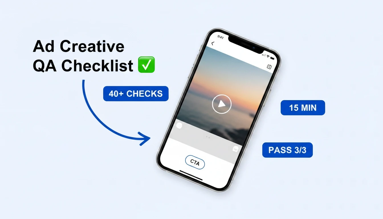
Every polished ad you see on Meta or TikTok passed a QA checklist before launch. The messy ones didn't.
If you're not QC'ing your ad edits, prepare to fail. One typo. One aspect ratio that crops the CTA. One audio spike that makes viewers mute you two seconds in. That's all it takes to turn a $50K creative test into a $50K reminder that you skipped the checklist.
This is the ad creative QA checklist I run (and have forced every editor on my team to run) before any ad goes live. It's organized into three passes — Watch, Listen, and Review — because that's the order your brain actually catches mistakes. It covers 40+ individual checkpoints across video, audio, on-screen text, safe zones, brand guidelines, and destination URLs. Save it, print it, Slack it to your editor — just don't launch without it.
Prefer to tick through it live? Use the free interactive version of this checklist →. Your progress saves automatically, and you can share a link with your editor so they see exactly what still needs to be checked.
Why ad creative QA isn't optional in 2026
According to IAB Tech Lab, nearly 1 in 3 display ads ship with a serious quality issue — broken render, file size problems, policy violations. Video is worse: most editors are reviewing in a 4:5 desktop preview while the ad ships to a 9:16 Reels placement where the bottom 35% gets eaten by UI.
Bad QA costs in three places: wasted ad spend on creative that gets rejected or under-delivers, brand damage from typos and sloppy text, and the opportunity cost of waiting 48 hours for a re-review after Meta flags a policy issue you could have caught in 30 seconds. Ad creative QA is the cheapest performance lever on the planet — it just has to actually get done.
The 3-pass QA method: Watch, Listen, Review
The single biggest QA mistake is reviewing everything at once. You end up half-watching with the sound on, half-reading the captions, and half-checking the CTA — and you miss all three. Split the review into three deliberate passes:
- Watch the full asset with the sound off, then again with it on.
- Listen to the full asset through headphones with your eyes closed.
- Review the ad against the brand and platform guidelines.
Each pass takes 2–5 minutes. Total QA time per ad: under 15 minutes. Compared to re-editing a rejected ad or explaining a typo to your CMO, it's nothing.
Pass 1: Watch the ad from start to finish
Before you touch anything else, hit play and watch the full asset. Don't skip ahead. Don't scrub. Watch it like a viewer would on their phone in line at Starbucks.
Timing and pacing
- Duration matches the platform spec. Feed videos 15–30s, Reels 9–60s, TikTok 9–60s, Stories ≤60s. If it's too long, it loses viewers. If it's too short, the message doesn't land.
- The hook lands in the first 1–2 seconds. Is there a visual, question, or pattern interrupt in the opening frame? If not, the watch rate will tank regardless of how good the rest is.
- No filler clips or dead air. Every second should be earning its place. If you can cut a 2-second "b-roll" shot without hurting the message, cut it.
- The main message is conveyed clearly. Could a viewer state the value prop after one watch? If not, the ad is either too rushed or too meandering.
Clip sequencing and script alignment
- Clips are sequenced in an order a viewer can follow. Problem → solution → proof → CTA is a reliable default. Jumping between concepts is where ads lose people.
- Every clip aligns with the script and voiceover. If the VO says "unbox the product" and the clip shows someone already holding it, the viewer notices even if they can't articulate why.
- No awkward cuts, black frames, or lingering clips. One stray black frame between clips will cost you.
- The first frame works as a standalone thumbnail. This is what shows in the feed before auto-play kicks in. Is it scroll-stopping on its own?
Format, sizing, and safe zones
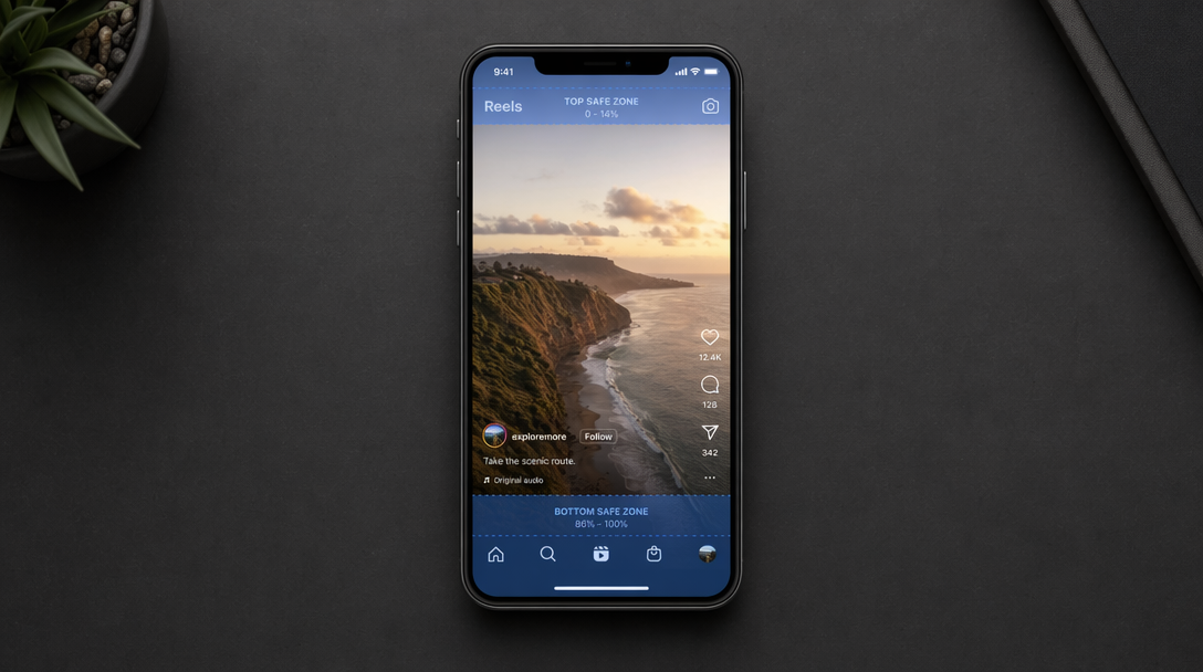 Top ~14% and bottom ~35% of a 9:16 placement get eaten by platform UI. Anything critical — text, CTA, logo — has to live in the middle.
- Exported in both 4:5 and 9:16 (and 1:1 if running on legacy placements). Do not rely on Meta's auto-crop.
- Both aspect ratios look intentional — not zoomed-in crops of the other.
- Safe zones respected. Stories need ~20% bottom clearance, Reels need ~35% for likes/comments/caption UI, TikTok needs ~45% on the right and bottom. Anything in those zones gets buried.
- Text stays away from the top 15% and bottom 35% on 9:16. If your CTA card is full-bleed, it's getting clipped.
- Resolution at least 1080×1920 for vertical, 1080×1350 for 4:5. Lower resolutions blur after platform compression.
- Under platform file size limits — Meta caps video at 4GB, TikTok at 500MB. Files at the ceiling upload slowly and are more likely to fail.
On-screen text (watch with sound OFF)
This is the single most common place ads fail QA. Mute the video, watch it through once or twice, and read every word of text as if you're seeing it for the first time.
- No spelling or grammar errors. Read every word. Don't trust spellcheck — it won't catch "your" vs. "you're."
- Fonts match brand guidelines. System default fonts look cheap. Stick to the brand font or a closely matching alternative.
- Text is legible on a 6-inch phone screen held at arm's length. If you have to squint on desktop, it's unreadable on mobile.
- Strong contrast between text and background. Dark text on light background (or vice versa) with no gradient behind that makes a word disappear.
- Text doesn't compete with the visual. If the viewer has to choose between reading the copy and watching the product demo, you've lost.
- No text clipped at any aspect ratio. Re-check after every export.
- Closed captions present and accurate. Meta reports 85%+ of video ads are watched without sound. No captions = no ad.
- Captions are synced — not leading or lagging the VO by more than 0.3 seconds.
- A clear, visible CTA exists. "Shop now," "Get 20% off," "Learn more." If the viewer has to guess what to do, they won't.
Skaler lets you search and analyze competitor ads across Meta, TikTok, and LinkedIn — so you can spot the creative patterns that actually pass QA and convert. Try it free →
Pass 2: Listen through headphones
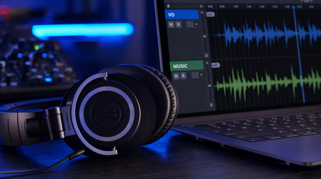 Audio issues — hums, volume spikes, VO buried under music — are almost impossible to catch on laptop speakers. Headphones, eyes closed, full watch.
Now close the preview window and listen to the ad through headphones with your eyes closed. You'll catch audio issues laptop speakers hide.
- Music track makes sense for the concept and brand. A high-energy EDM track under a luxury skincare ad is a tone mismatch, even if the cut-to-beat timing is perfect.
- Music aligns with the tone shift from hook → problem → solution → CTA. The same track at the same volume for 30 seconds is boring.
- No intense drop-offs, volume spikes, or harsh level changes. These make viewers mute the ad or scroll.
- Background noise scrubbed. Hums, HVAC, wind, room tone. If you hear it in headphones, viewers hear it too.
- Audio enhancer applied if the source was rough. Adobe Podcast, Descript Studio Sound, or CapCut's voice enhance can save UGC audio that was recorded in a kitchen.
- Lip sync matches the speaking — especially critical for AI-generated or dubbed content. Off-sync lips make ads feel fake.
- VO sits on top of the music, not fighting it. The rule: if you can't clearly understand every word of the VO with the music at its peak, the music is too loud.
- VO volume consistent across the ad. No clips where the speaker is 30% quieter than the rest.
- Music fades cleanly at the end. An abrupt cut on the last frame is jarring.
- Sound effects are intentional, not layered in by default. One well-placed "cha-ching" at the price reveal > eight random whooshes between every transition.
Pass 3: Review against brand and platform guidelines
Last pass: is this actually on-brand, compliant, and technically ready to ship?
- Brand do's and don'ts reviewed. Every brand has them. Pull the brand book and compare.
- Logo usage, color palette, and tone aligned with brand guidelines — no off-brand blues, no off-brand voice.
- Platform policy review. Check for Meta's restricted categories (health claims, personal attributes, before/after), TikTok's content guidelines, and LinkedIn's professional standards.
- Disclaimers present where required — "Results may vary," "Paid partnership," "Sponsored," health disclosures.
- UGC rights confirmed. Do you have written permission to use the creator's face and voice in paid media? "They tagged us" is not permission.
- Music licensed. Your favorite trending TikTok sound is almost certainly not cleared for paid ads. Use the platform's commercial music library or pay for a license.
- Destination URL works and loads in under 3 seconds on mobile. Click it yourself.
- Landing page matches the ad's promise. If the ad says 40% off, the landing page better show 40% off above the fold.
- UTMs tagged correctly. Campaign, source, medium, content. Test in a UTM builder before launch.
- Pixel firing. Open the page in Meta Pixel Helper and confirm events are tracking.
What "passing the checklist" actually looks like
Here are a handful of real, high-performing ads currently running on Meta that pass every check above — tight pacing, readable text, captions synced, safe zones respected, strong CTA. Use them as a benchmark for your own edits.
Notice what they all have in common: the hook lands in the first frame ("Which earplugs would you choose?", "This is how a dash of arnica ended Botox", "The best hotels in the world don't replace their sheets every few months like you do"), the text is large and legible, the CTA is unmistakable, and the VO never fights the music. None of that happens by accident — it happens because someone ran a checklist.
Who should do the final QA
Not the person who edited the ad.
Editors develop blind spots on their own work within 24 hours — you'll read past the same typo five times because your brain remembers what it meant to say, not what's on screen. The final QA should sit with one other person: a media buyer, creative strategist, or performance lead who understands the brief, the brand, and the platform.
Getting input from the whole team during production is fine. Sign-off is not a committee sport. One name on the checklist, one point of accountability, one bottleneck — but a bottleneck you can actually fix if a bad ad ships.
Make it a system, not a one-off
The difference between teams that ship polished ads weekly and teams that ship a typo every month is not talent — it's systemization. Three things to put in place:
- A shared QA template in Notion, Google Docs, or Asana. Copy this checklist in. Every ad gets its own copy filled out before launch.
- A named sign-off owner per ad or per campaign.
- A "QA misses" log — every time something slips through, log it. After a month you'll see patterns (always the same editor, always Reels safe zones, always captions). Fix the root cause, not the symptom.
Pair that with a benchmarking habit: spend 10 minutes a week looking at what competitors are actually shipping to production. Their polished ads set the bar you're trying to clear. Their sloppy ads are a reminder that even brands with big budgets skip the checklist — and you can out-execute them on QA alone.
For more on building that benchmarking muscle, see our posts on 5 ad creative best practices, why Facebook ads aren't converting, and how to analyze ad performance.
Frequently asked questions
How long should ad creative QA take per ad? Under 15 minutes for a short-form video ad. 5 minutes for a static. If it's taking longer, either the ad has serious issues or the checklist is being re-read at every step instead of memorized. A senior media buyer should be able to run the full 40+ check pass in under 10 minutes.
Should I QA before or after uploading to Meta Ads Manager? Both. QA the exported file before upload (everything above), then use Meta's ad preview tool to check every placement (Feed, Stories, Reels, Explore, Marketplace) after upload. Meta's preview is the only way to see how the ad actually renders inside each UI.
What tools can I use for ad QA? For video spec validation: Meta's Placement Asset Customization and TikTok's Ad Preview. For safe zone checks: the Meta Ads Safe Zone Visualizer or TikTok's safe zone guides. For audio cleanup: Adobe Podcast or Descript. For destination URL and pixel checks: Meta Pixel Helper. For spellcheck on captions: literally just Grammarly, open-tab, paste.
How do I know if my ad will pass Meta's policy review? Run the ad copy and creative through Meta's advertising policies ahead of launch. Common red flags: before/after imagery, weight-loss claims, language implying personal attributes ("Are you struggling with…?"), health or medical claims without disclaimers, and unsubstantiated superlatives ("the #1 solution"). When in doubt, A/B the safer version — Meta's classifiers are stricter than humans.
What's the biggest QA mistake teams make? Reviewing with sound on first. Turn the sound off and do a full pass. 85% of viewers see the ad that way. If it doesn't land mute, it doesn't land.
Resources
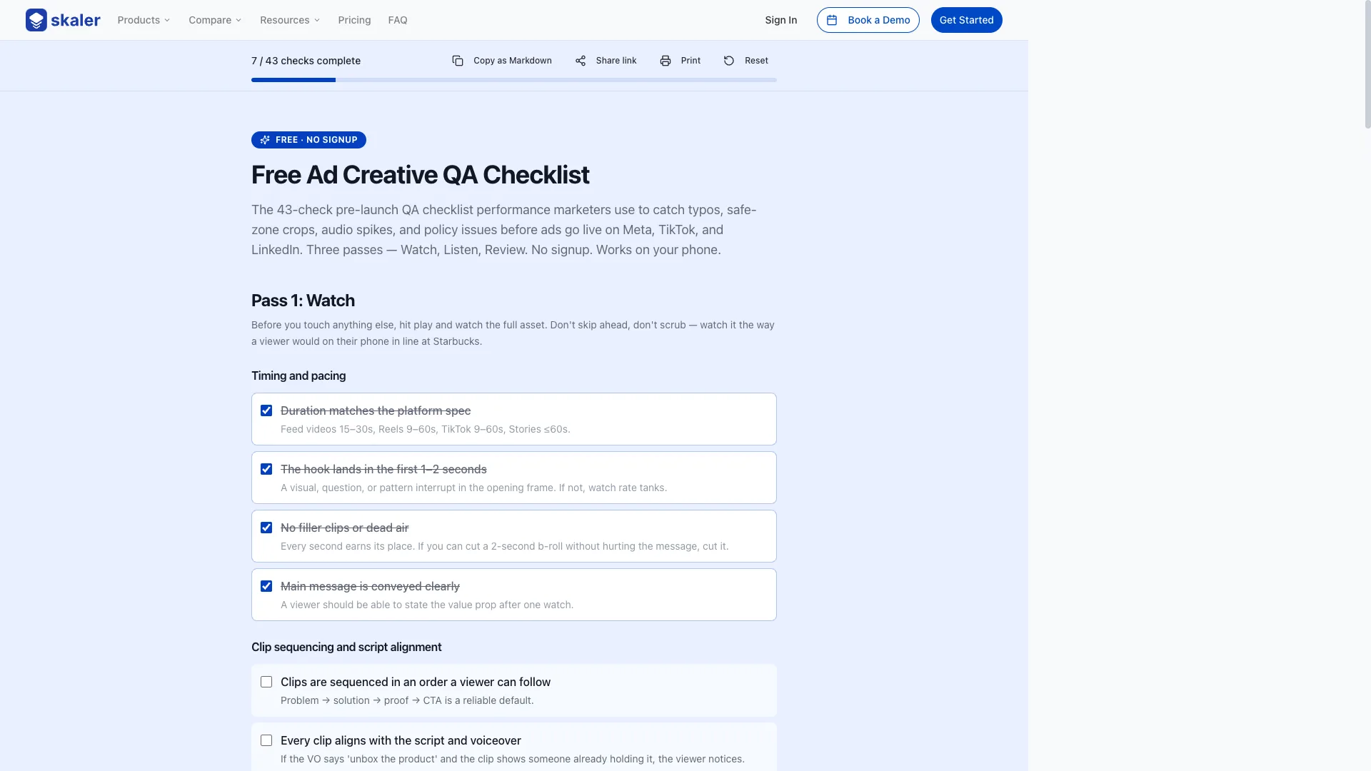
- Free interactive ad QA checklist — the 43 checks above, as a live tool. Tick them off on your phone during review, and your progress is saved locally. Hit Copy as Markdown to paste the filled-out checklist into Notion or Google Docs, or Share link to send a teammate a URL with the exact state of your review. No signup.
- Ad examples library — real, currently-running ads you can use as the benchmark every check on this page is trying to help you hit.
- 5 ad creative best practices — the production-side decisions that determine whether QA even has a chance to pass.
- How to analyze ad performance — once the ad is live, how to read the numbers so you know whether the QA paid off.
The takeaway
Ad creative QA is not about perfectionism. It's about not shipping obviously broken work. A 15-minute checklist catches 95% of the issues that would have tanked the test — and every one you catch pre-launch is one you don't have to explain to your boss post-launch.
Print the checklist. Assign a sign-off owner. Run every pass on every ad. Do that for 30 days and you'll see the rejection rate fall, the CTR rise, and the "did we really ship that?" Slack messages disappear.
Benchmark your QA against what's actually winning
The fastest way to raise your QA bar is to see exactly what polished, high-performing competitor ads look like — frame by frame, text overlay by text overlay.
Skaler lets you search, filter, and save high-performing competitor ads across Meta, TikTok, and LinkedIn — so you can benchmark your own creative against what's actually winning in your category. Start free, no credit card →
Related Articles
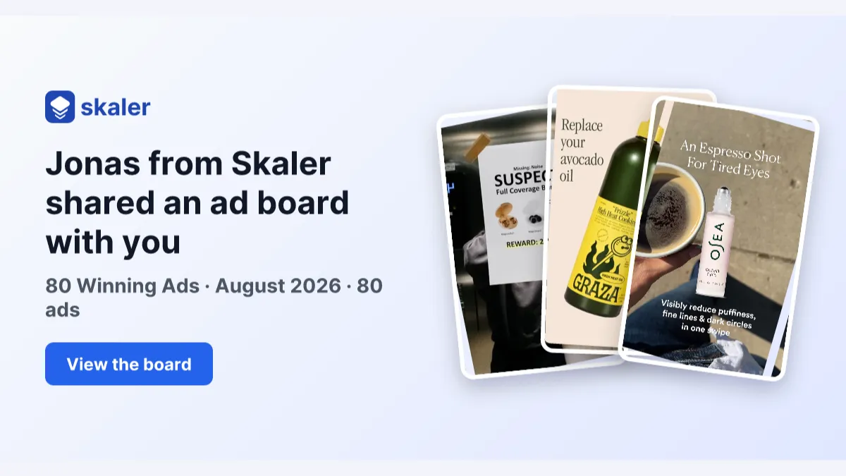
The 80 Most-Saved Meta Ads of August 2026 (Free Swipe File)
We tracked the 80 Meta ads media buyers saved the most this month — from Seed and Loop to AI soap operas running across 9 ad sets. Browse all 80 free, plus the 4 patterns behind them.
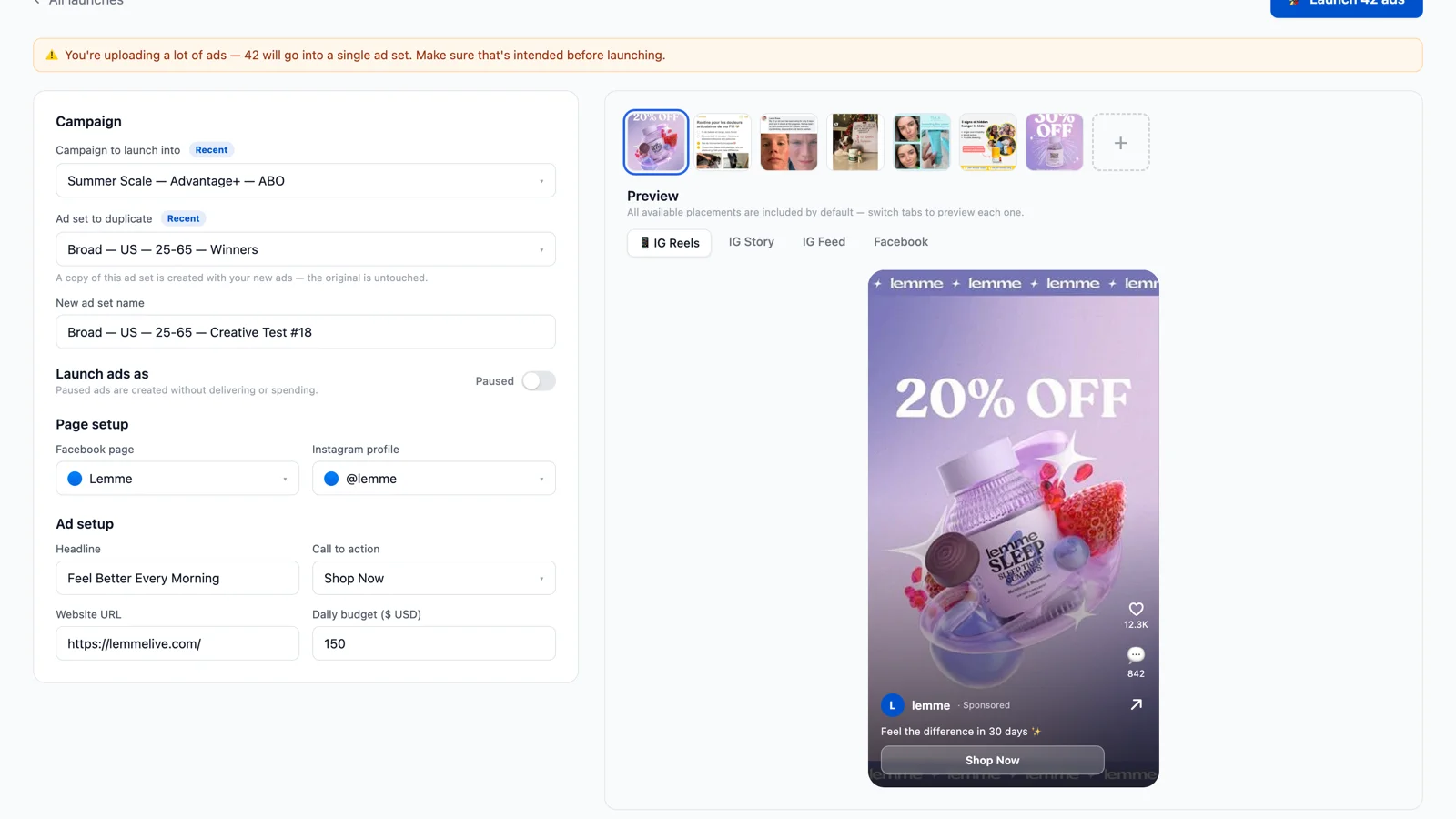
Bulk Ad Launcher for Meta: Launch 100 Facebook Ads in One Click
Skaler's new Bulk Ad Launcher takes you from creatives to live Facebook ads in minutes — drag and drop up to 100 files, duplicate a winning ad set, and launch with copy, budgets, and tracking auto-filled.