
Static Ads in 2025: What They Are, 25+ Proven Examples, and When to Use Static vs Dynamic vs Video
A modern playbook for static ads in 2025 — definition, 25+ example patterns, static vs dynamic vs video decision framework, specs, templates, and a fast testing plan.

 Follow on LinkedIn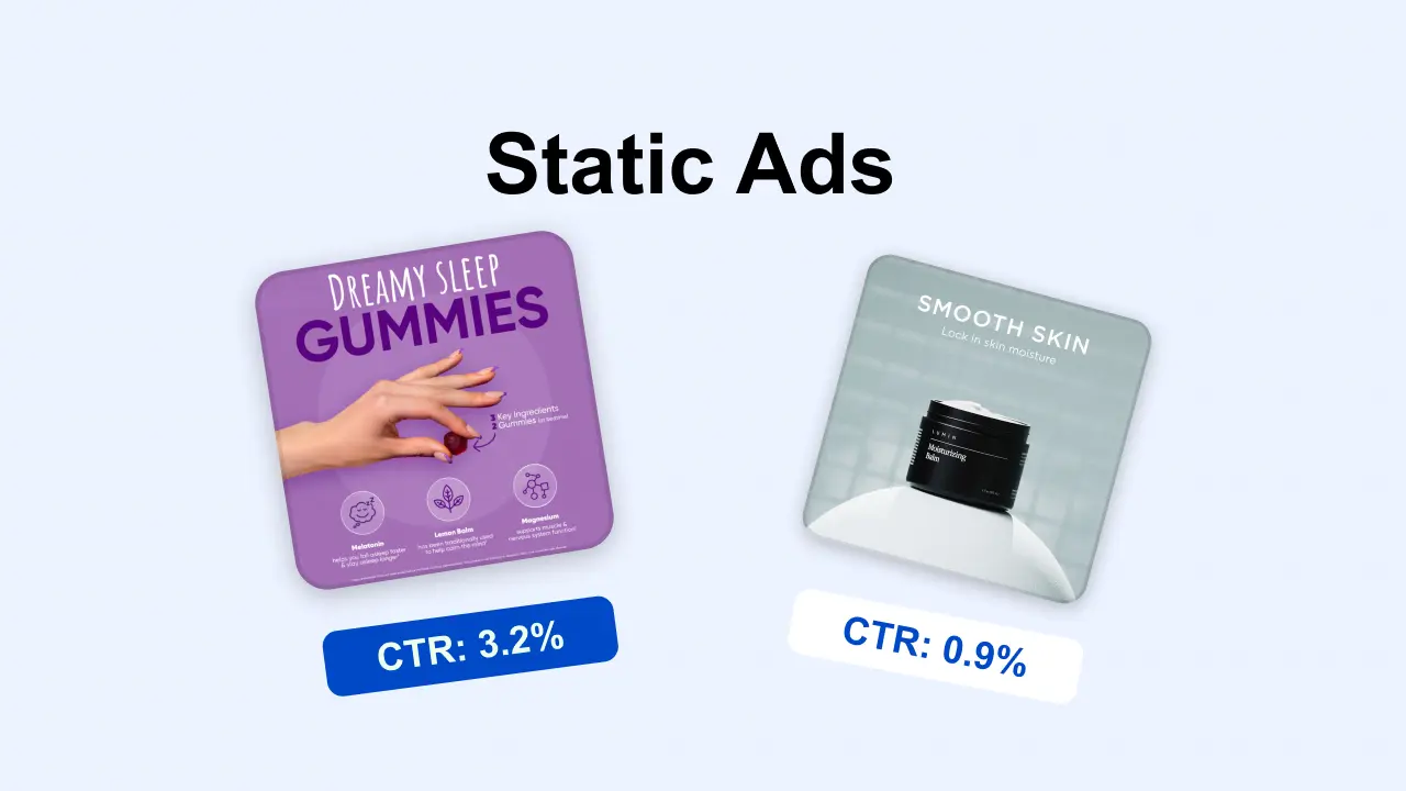
Static ads are still one of the highest-leverage ad formats in 2025 — not because they're trendy, but because they're fast to produce, easy to test, and brutally clear.
Even as platforms push automation and video harder, performance teams still need a reliable way to:
- validate new angles fast
- test offers without creative overhead
- control the exact message (claim → proof → CTA)
- learn what's working before scaling into heavier formats
A few "what's happening now" signals that matter:
- Digital video spend keeps climbing — IAB reported +18% YoY in 2024 to $64B, projecting $72B in 2025 in the U.S. (useful context, not a mandate to only run video): IAB 2025 Digital Video Ad Spend & Strategy Report
- TikTok is explicitly investing in Image Ads as a format to increase creative variety and make it easier to remix existing assets: TikTok Image Ads guide
None of this makes static obsolete. It makes static more important as a controlled testing tool.
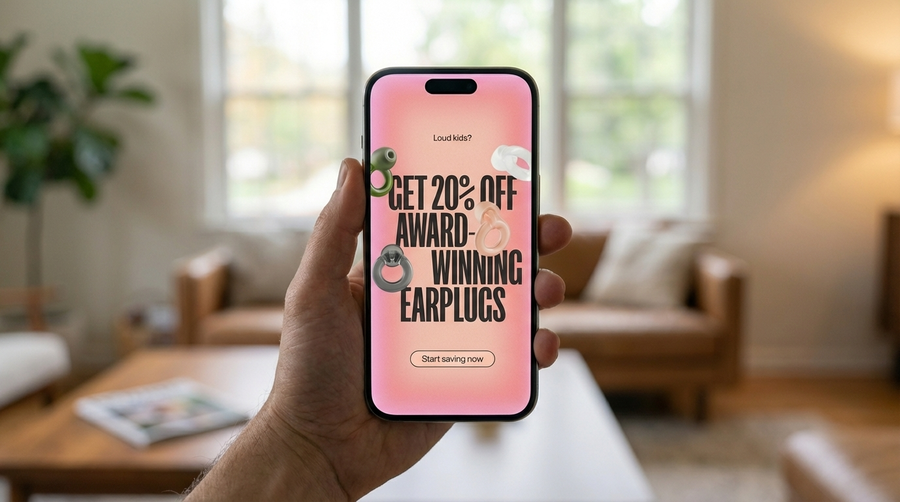 A static ad does one thing well: delivers a clear message instantly.
Table of contents
- What are static ads?
- Static ads vs dynamic ads vs video ads: when to use which
- 25+ static ad examples (with patterns you can copy)
- What makes a static ad convert (checklist)
- Static ad templates (copy/paste)
- Sizes, specs, and safe-zone basics
- How to test static ads fast (3×3 method)
- A practical workflow for building a static-ad system
- FAQ
What are static ads?
A static ad is a fixed creative (usually a single image + copy) that shows the same content to everyone who sees it.
Static ads commonly appear across:
- Meta (Facebook/Instagram)
- Display networks
- TikTok (image formats)
What static ads are NOT
Static ads are not:
- Dynamic product ads (catalog/feed-driven product swapping)
- Dynamic creative that automatically mixes and matches different headlines/images per viewer
- Video ads (even if the "video" barely moves)
A design can look "dynamic" (bold overlays, punchy typography) while still being a static ad — if the content doesn't change per user, it's static.
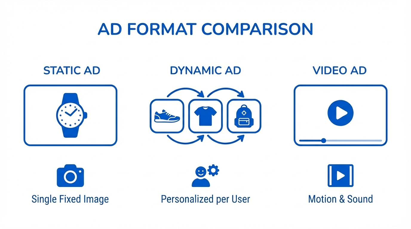 Static = same content for everyone. Dynamic = personalized per user. Video = motion and demonstration.
Static ads vs dynamic ads vs video ads: when to use which
Choosing the right format is less about ideology and more about what you're trying to learn.
Use static ads when you need speed + control
Static ads are the best choice when:
- you're testing new angles or hooks
- you need message control (exact claim, exact proof)
- you want clean attribution (what changed = what caused the result)
- you're early in a campaign and need a winner before scaling
Use dynamic ads when personalization is the point
Dynamic works when:
- you have a clean product feed/catalog
- you're retargeting or running high-intent audiences
- price/inventory changes frequently
- you want the system to select products and variations at scale
Meta continues to invest in Advantage+ catalog workflows and creative enhancements (overlays, background generation, etc.). If you run catalog/dynamic, review:
Use video when demonstration and trust are the bottleneck
Video is worth the effort when:
- the product needs demo (how it works, what it feels like)
- the buying decision depends on trust (UGC/creator-native)
- you're selling a transformation static can't communicate quickly
And yes — video spend is growing fast overall (IAB numbers above), but that's a market trend, not a rule for every campaign.
TikTok placement note (important)
TikTok promotes Image Ads as a format, but its policies for video ads emphasize that ad content must be dynamic and should not rely primarily on still images:
Translation: use static in the right format/placement, not as "fake video."
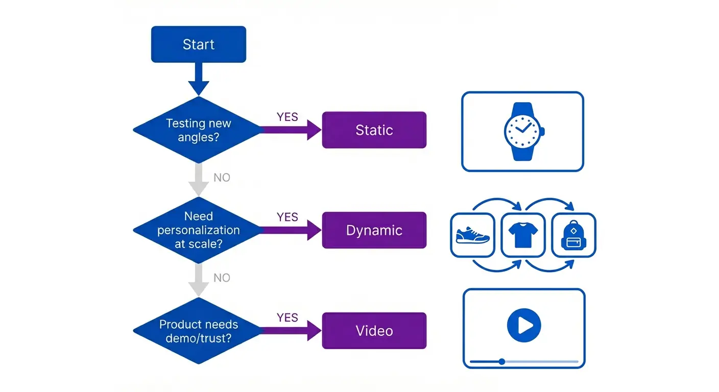 Use this quick decision tree to pick the right ad format for your goal.
25+ static ad examples (with patterns you can copy)
The goal isn't to copy designs — it's to copy structures that repeat across winners: claim → proof → offer → CTA.
Below are patterns you can reuse in any niche.
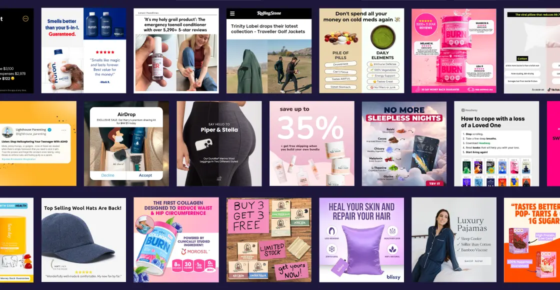 The 10 patterns that show up again and again in top-performing static ads.
Pattern 1: One-Claim Hero (clarity beats complexity)
What it is: one image, one claim, one CTA.
Why it works: people decide faster when there's less to process.
Do:
- 3–7 words on-image headline
- one focal point (product or outcome)
- one proof element close to the claim (rating, count, guarantee)
Avoid:
- multiple offers in one creative
- paragraphs on the image
Best for: cold prospecting, broad audiences
Fast variation: keep the layout; rotate the claim angle (speed vs savings vs quality)
Pattern 2: Offer Stack (price + bonus + deadline)
What it is: the offer becomes the creative.
Why it works: reduces hesitation.
Do:
- anchor price ("$79 → $49 today")
- add one bonus (free shipping, free gift, extra item)
- use real urgency (shipping cutoff, limited run)
Avoid: vague urgency with no reason
Best for: retargeting, warm traffic
Fast variation: test offer framing (percent off vs bundle vs "starter kit")
Pattern 3: Social Proof Tiles (trust in one glance)
What it is: ratings + short reviews + recognizable proof.
Why it works: compresses credibility into the creative.
Do:
- 2–4 short quotes (one sentence)
- show rating + review count
- include proof next to the claim (not below it)
Avoid: tiny unreadable testimonial blocks
Best for: skeptical audiences
Fast variation: rotate proof type (reviews → UGC quote → "as seen in" → guarantee)
Pattern 4: Before/After (or Wrong/Right)
What it is: visual contrast.
Why it works: communicates value without explanation.
Do:
- clear labeling (before/after)
- realistic, believable transformation
- one line of context (timeframe or use-case)
Avoid: exaggerated claims or unclear changes
Best for: products with visible outcomes
Fast variation: use "wrong/right" comparisons when compliance or claims are sensitive
Pattern 5: Comparison Grid (decision support)
What it is: "us vs old way" without naming competitors.
Why it works: helps people justify switching.
Do:
- 3 columns max
- 5 rows max
- compare categories ("generic", "DIY", "premium")
Avoid: dense tables with tiny text
Best for: consideration stage
Fast variation: compare to "old habit" instead of "other tools"
Pattern 6: Feature Callouts (structured information)
What it is: product centered + 3–5 labeled callouts.
Why it works: it's clear, scannable info.
Do:
- call out only purchase-driving features
- connect features to outcomes ("HEPA filter → less dust")
Avoid: listing every feature you can think of
Best for: products with tangible specs
Fast variation: swap callouts for different segments (e.g., "for kids", "for travel", "for sensitive skin")
Pattern 7: Human Face / Founder Frame (attention + trust)
What it is: a real person + a clear promise.
Why it works: humans pull attention; story creates belief.
Do:
- "We built this because…" (one pain point)
- one bold claim + one proof element
- keep on-image copy short
Avoid: long founder stories on the creative
Best for: brands with differentiation
Fast variation: founder story vs customer story
Pattern 8: Meme Hook (attention-first, still sells)
What it is: native humor + direct CTA.
Why it works: attention opens the door to conversion.
Do:
- keep it specific (a real pain point)
- bridge to the product with a clear offer
Avoid: meme with no selling bridge
Best for: top-of-funnel, social feeds
Fast variation: same template, different segment-specific punchline
Pattern 9: Educational Static (micro-value)
What it is: checklist / myth vs fact / mini-framework.
Why it works: earns attention, then sells.
Do:
- 3 bullets max on-image
- one action CTA ("steal this template")
Avoid: "blog post on an image"
Best for: TOF clicks + retargeting pool building
Fast variation: expand winners into carousels later
Pattern 10: Lifestyle Outcome (emotion + simplicity)
What it is: lifestyle image + one outcome (comfort, confidence, relief).
Why it works: desire sells when clarity stays intact.
Do: pick one emotion + one promise
Avoid: cluttering lifestyle images with feature lists
Best for: fashion, home, wellness, food
Fast variation: same photo, different outcome claim
Quick-hit patterns (use as needed)
- Guarantee-first headline ("30-day refund")
- FAQ answer ad ("Does it work for X?")
- Seasonal shipping cutoff (real deadlines)
- Bundle builder (A + B + C → outcome)
- Price-per-day framing (only when true)
What makes a static ad convert (checklist)
Use this as your pre-flight audit.
1) 2-second clarity
- can a distracted scroller understand it instantly?
- one focal point
- one claim
- one CTA
2) Claim + proof proximity
If the claim is bold, proof must be visible:
- rating + count
- short testimonial
- guarantee
- recognizable credential (only if true)
3) One audience, one promise
Static isn't a landing page. Pick one promise and commit.
4) Message match with the landing page
Same promise above the fold. Same offer. Same expectation.
5) Mobile-first typography
- big type
- high contrast
- generous spacing
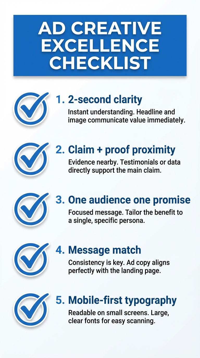 The 5-point pre-flight audit for static ads that convert.
Static ad templates (copy/paste)
Template A — One-Claim Hero
Headline: Get {outcome} in {timeframe}
Primary text: Meet {product} — built for {audience} who want {outcome} without {pain}.
CTA: Get started
Template B — Offer Stack
Headline: {X}% off ends {day}
Primary text: Best-sellers back in stock. Bundle & save + {bonus} today.
CTA: Claim offer
Template C — Proof-first
Headline: Rated {rating}★ by {count}+ customers
Primary text: The {category} people reorder. Try it risk-free.
CTA: See why
Template D — Objection killer
Headline: "Does it work for {segment}?"
Primary text: Yes — here's why: {proof}.
CTA: Learn more
Template E — Old way vs New way
Headline: Stop doing {old way}
Primary text: Switch to {product} for {benefit 1}, {benefit 2}.
CTA: Compare
Sizes, specs, and safe-zone basics
Specs vary by placement, but these rules hold:
Start with 3 master sizes:
- 1:1 (square)
- 4:5 (feed)
- 9:16 (stories/reels)
Safe-zone rule: keep critical elements (claim, logo, CTA) away from edges. Assume cropping.
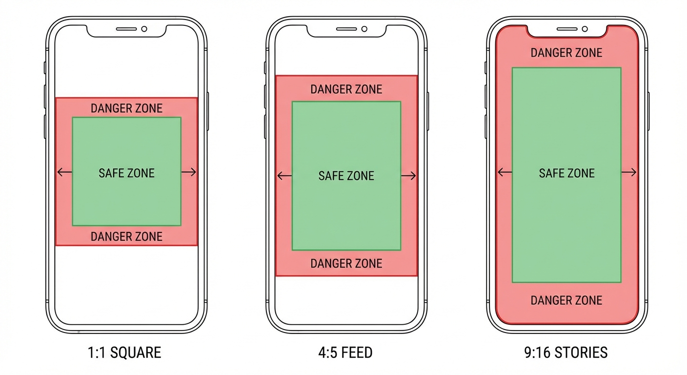 Safe zones for 1:1, 4:5, and 9:16 static ads — keep key elements inside the green areas.
For TikTok image formats:
For TikTok video policy guidance around static content:
How to test static ads fast (3×3 method)
The advantage of static is iteration speed — use it.
The 3×3 method
Pick:
- 3 angles (speed / savings / quality)
- 3 visuals (product-only / lifestyle / proof)
That gives you 9 static ads.
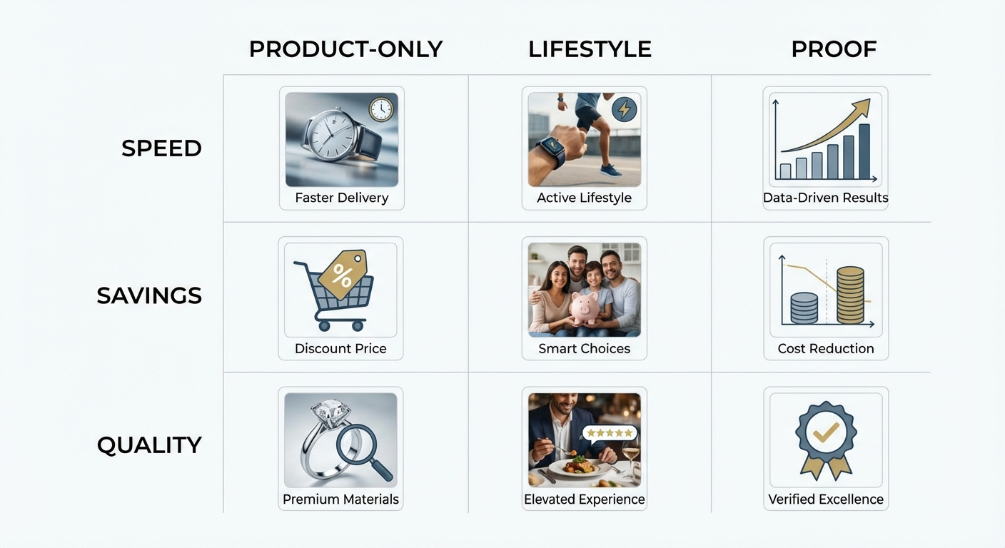 The 3×3 method: 3 angles × 3 visuals = 9 ads to test.
Run conditions for clean learning
- same audience
- same budget
- same landing page
- same attribution window
Kill/keep rules (simple)
- Low CTR + high CPC → hook/visual isn't stopping thumbs
- High CTR + low CVR → mismatch (creative promise ≠ landing page reality)
- Good CVR + high CPA → offer or audience problem (not necessarily creative)
Scaling rule
When you find a winner, don't instantly make 50 variants. Make 3 controlled variations:
- change the claim angle
- change proof type
- change offer framing
Scale what holds.
A practical workflow for building a static-ad system
Most teams don't fail because they can't "make a static ad." They fail because they don't have a reliable system for:
- collecting high-signal examples
- labeling what makes them work
- turning winners into controlled variations
A simple workflow:
-
Collect examples by niche and intent
Prospecting vs retargeting vs promo vs launch. -
Tag by pattern
One-Claim Hero, Offer Stack, Proof Tiles, Before/After, Comparison Grid, etc. -
Turn one winner into three controlled variations
Same structure, small changes: claim/proof/offer. -
Track pattern repeatability
The patterns that keep producing winners become your "house style."
If you're using Skaler, this maps cleanly to how teams actually work:
- save static examples into a swipe file
- tag by pattern + funnel stage
- generate a few controlled variations while keeping the core structure intact
- monitor what patterns repeat across top performers
FAQ
What are static ads?
Static ads are fixed creatives (usually an image + copy) that show the same content to every viewer.
Do static ads still work in 2025?
Yes — especially for validating angles/offers quickly and maintaining message control.
When should I use dynamic ads versus static ads?
Use static for controlled testing and clear messaging. Use dynamic when you have a clean feed/catalog and want personalization at scale (especially retargeting).
Meta background generation and Advantage+ catalog enhancements are worth reviewing if you go dynamic:
- https://www.facebook.com/business/help/397103717129942
- https://www.facebook.com/business/help/981940746195135
Static vs video: which converts better?
Neither wins universally. Video is growing fast overall (IAB projects $72B U.S. digital video spend in 2025), but static often wins on speed of iteration and message clarity — especially early in campaigns:
TL;DR
Static ads win in 2025 because they're the fastest way to test:
- a clear claim
- a real offer
- believable proof
Use static to find winners.
Use video to demonstrate and build trust.
Use dynamic when your feed is ready and personalization is the point.
If you want a single next step: build 9 statics (3×3), run a clean test, and let results pick the format.
Related Resources
- Top 9 Brands Crushing EU/UK Facebook Ads — Real examples from brands spending €100K+/month
- Facebook Ads Not Converting? 15 Fixes for 2025 — Diagnose why your ads aren't working
- 5 Ad Creative Best Practices — Strategies that actually drive conversions
- Meta Ads Library: Complete 2025 Guide — How to research competitor ads for free
- How to Analyze Ad Performance — A data-driven approach to creative analytics
- Best AI Ad Generators in 2025 — Compare tools for creating ads with AI
Get Help
Have questions about static ads? We're here to help:
- In-app support: Click the help icon in the bottom right
- Email: hello@skaler.app
Ready to build your static ad library? Start free with Skaler and save winning examples, organize by pattern, and generate variations in minutes.
Related Articles
The 80 Most-Saved Meta Ads of August 2026 (Free Swipe File)
We tracked the 80 Meta ads media buyers saved the most this month — from Seed and Loop to AI soap operas running across 9 ad sets. Browse all 80 free, plus the 4 patterns behind them.
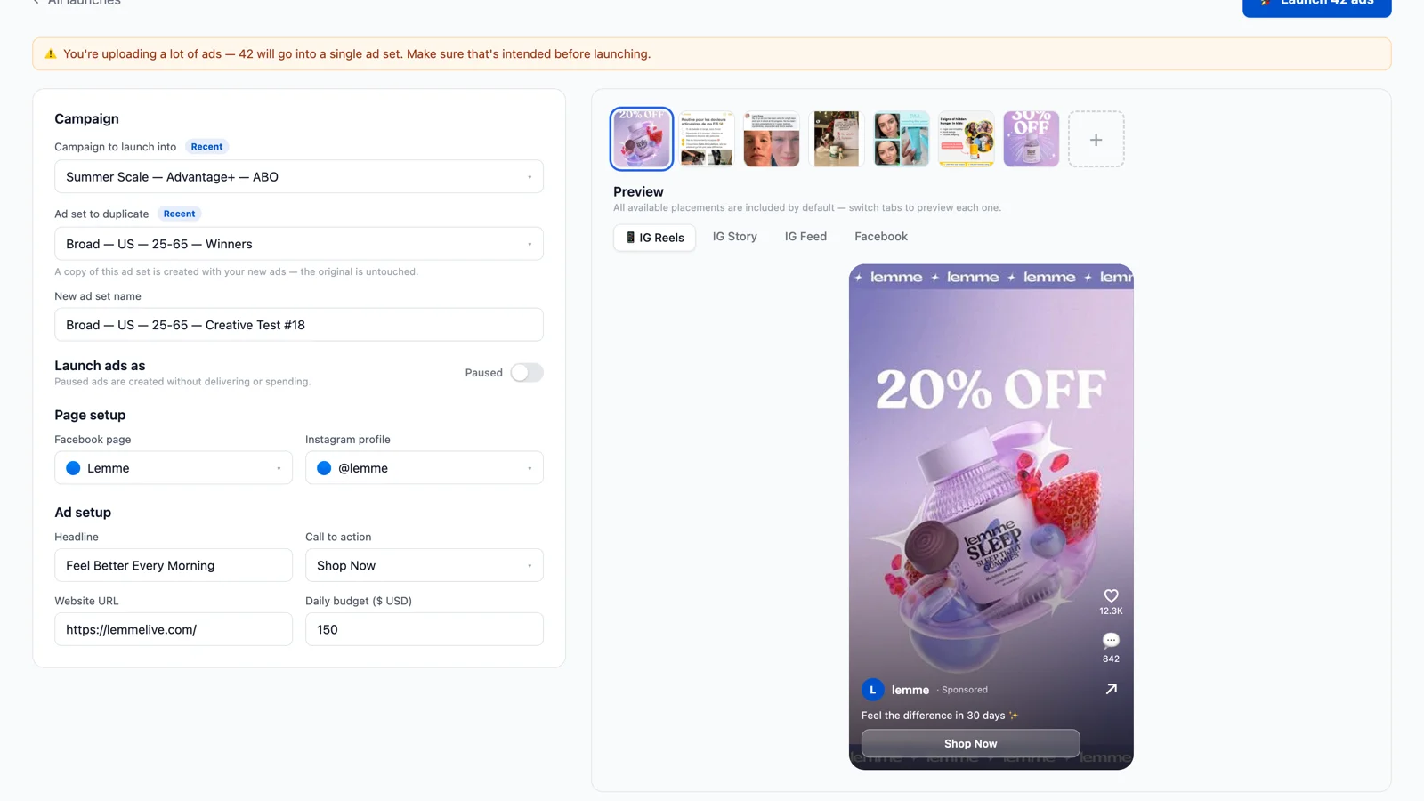
Bulk Ad Launcher for Meta: Launch 100 Facebook Ads in One Click
Skaler's new Bulk Ad Launcher takes you from creatives to live Facebook ads in minutes — drag and drop up to 100 files, duplicate a winning ad set, and launch with copy, budgets, and tracking auto-filled.